Where do you do your best work? What do you need to concentrate, be happy, focus, feel calm and centered? What do you want your space to look like, sound like, feel like when you have work to do?
I recently asked a group of educators this question during a workshop. People responded by talking about:
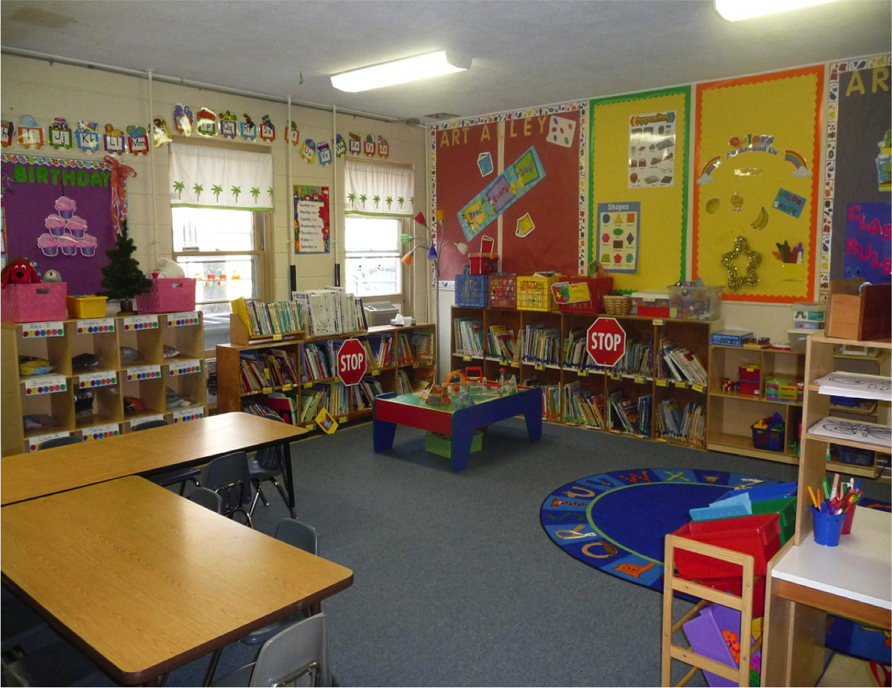
In my work with student teachers I often ask them about what a classroom for young children should look like. Most often mentioned are: "bright colors", "lots of pictures"(usually posters from catalogues), and "hanging up all of children's work on the walls". These students are verbalizing a set of commonly held assumptions about what children need in order to learn.
Some of these assumptions are:
But these assumptions could not be further from the truth.
Research has long asserted that there are particular elements of a classroom that support learning and well-being, as a recent article by Sarika Bansal illustrates. A few years ago Teachers College Press asked me to put together a book, Thinking Critically About Environments for Young Children, that would help educators consider many ways to approach aspects of early childhood environments - from classroom design, gardens & playgrounds, science, technology, & museums, as well as the relationship between the way classrooms look and approaches to curriculum.
As I did research for the book I discovered that there are some pretty strong design norms for schools and classrooms, and that people are very attached to them - but that they may not be meeting children's needs. Pat Tarr, in her 2004 article Consider the Walls, asks teachers to think about what they choose to put on the walls and why. Her article is intentionally provocative - you may not agree, but you will think.
The walls are not the only thing to consider. Arrangement of furniture and children's ability to access materials impact how and what children learn. Think about the two block shelves below. What do children learn about spatial relationships, being organized, cleaning up, care of materials, and order in each arrangement?
And if we come back to our original question, Where do you do your best work?, the list the educators made about what they need might become the benchmarks for all environments in schools, centers, and family childcare - an on up through the grades. We might begin to think differently about how we design schools and classrooms, and how we structure space and time for learning.
- spaces free of clutter
- natural light
- comfortable furniture
- easy access to materials
- the ability to move when you need to
- space to concentrate and work alone
- collaboration
- quiet
In my work with student teachers I often ask them about what a classroom for young children should look like. Most often mentioned are: "bright colors", "lots of pictures"(usually posters from catalogues), and "hanging up all of children's work on the walls". These students are verbalizing a set of commonly held assumptions about what children need in order to learn.
 |
| This looks neat but may be over stimulating for some children. There are also limited materials
to choose from.
|
- Children crave constant visual stimulation and novelty.
- Bright colors are the appropriate colors for a classroom - the more the better.
- Children like clutter and mess and mess=fun.
- Children will learn if we cover all the walls with text related to behavior and content.
- Adults are the source of learning and must keep activities moving at a steady pace and tell children when and where to move.
Research has long asserted that there are particular elements of a classroom that support learning and well-being, as a recent article by Sarika Bansal illustrates. A few years ago Teachers College Press asked me to put together a book, Thinking Critically About Environments for Young Children, that would help educators consider many ways to approach aspects of early childhood environments - from classroom design, gardens & playgrounds, science, technology, & museums, as well as the relationship between the way classrooms look and approaches to curriculum.
As I did research for the book I discovered that there are some pretty strong design norms for schools and classrooms, and that people are very attached to them - but that they may not be meeting children's needs. Pat Tarr, in her 2004 article Consider the Walls, asks teachers to think about what they choose to put on the walls and why. Her article is intentionally provocative - you may not agree, but you will think.
The walls are not the only thing to consider. Arrangement of furniture and children's ability to access materials impact how and what children learn. Think about the two block shelves below. What do children learn about spatial relationships, being organized, cleaning up, care of materials, and order in each arrangement?
A New York Times article last year highlighted that kindergarteners in highly decorated classrooms were more distracted. The very things that were intended to improve learning were actually inhibiting children from doing their best work. But this is about more than beautiful spaces - it is also about accessible, challenging materials that encourage thinking, and giving children and teachers the time to dig into rich investigations with these materials.
 |
| Natural light, low level lighting, unique artwork, neutral tones, accessible materials, room to move. |


No comments:
Post a Comment